PeptideAI
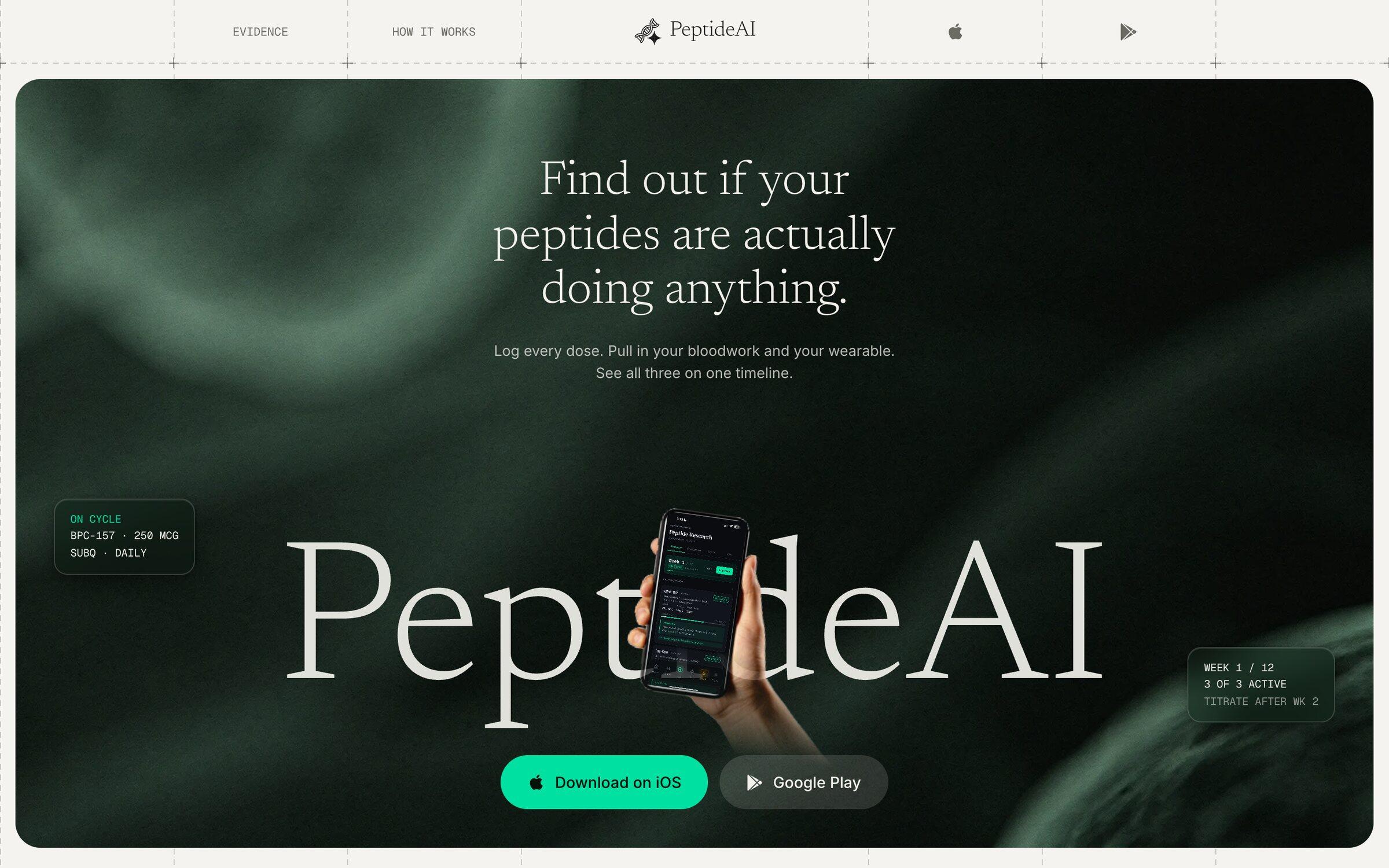
A landing page for PeptideAI, an app for tracking peptide protocols, and the design system peptideai.co now runs on.
peptideai.co runs on the design system I wrote up, and their team keeps building on it.
- For
- PeptideAI
- Role
- Design
- Build
- Design system
- When
- Aug 2026
- Stack
- Next.js
- Netlify
- Live
- My build peptideai.co
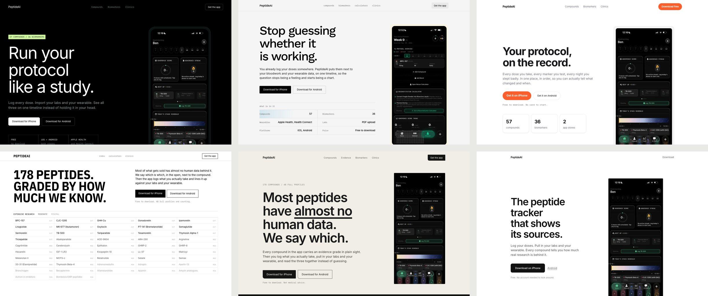
I built six hero directions and cut all six
I offered on a call to remake PeptideAI's website. I started with six hero directions built as real pages, each locked to a different reference, from a lab notebook to a type specimen catalogue to a single App Store screen. I cut all six. What I kept was the serif from one of them on a layout I had found, and the headline moved to the outcome: find out if your peptides are actually doing anything.
The page sits on a dashed eight column grid
The grid takes after the modern software startup sites I kept looking at: eight columns of dashed hairlines running edge to edge, the two outer columns empty, and a crosshair only where four lines cross, or three. The hero is a dark card that stops just short of the screen edge, with deep green behind PeptideAI in a huge serif and a hand holding the phone through the middle of the word.
The page shows how much research backs each compound
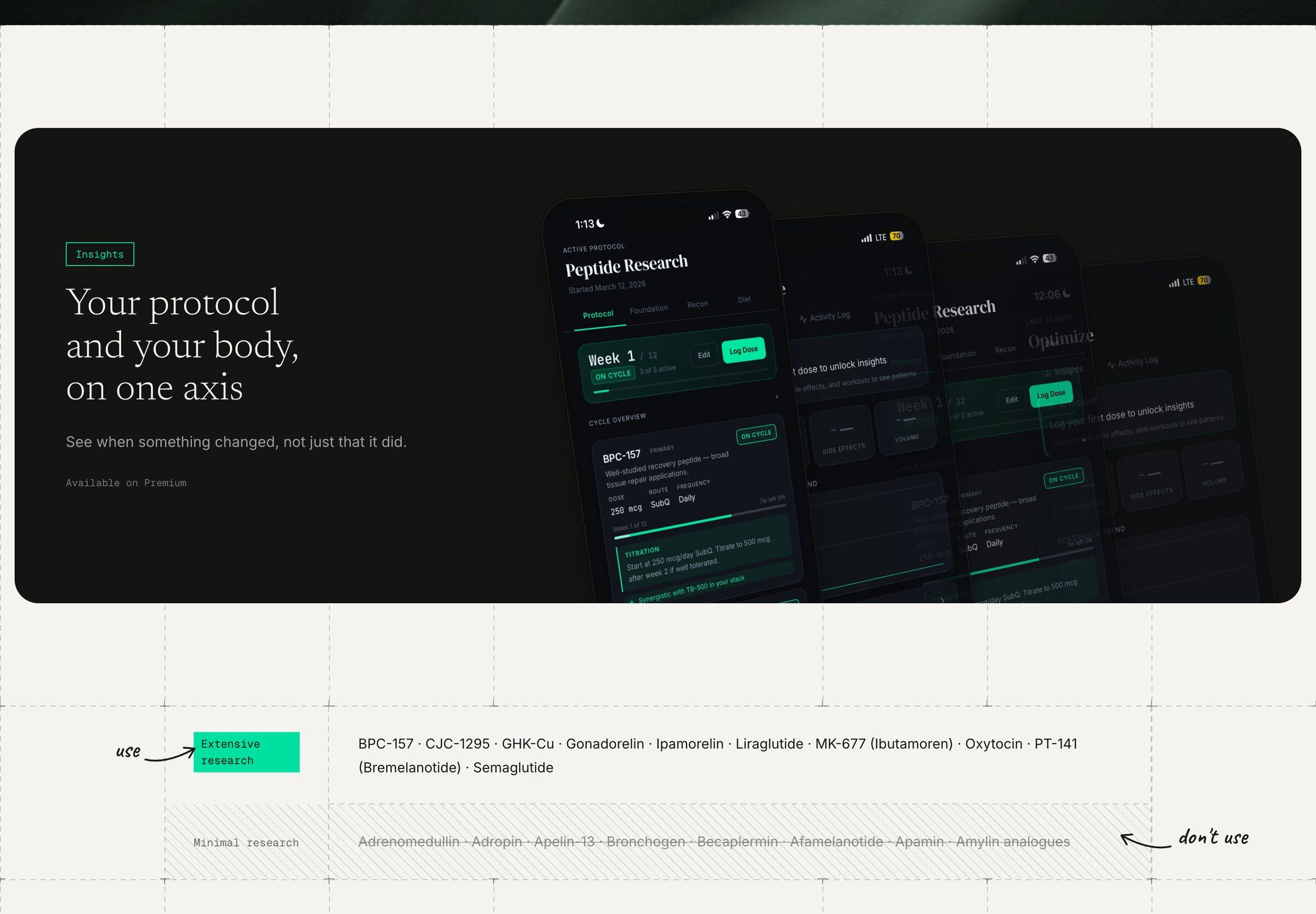
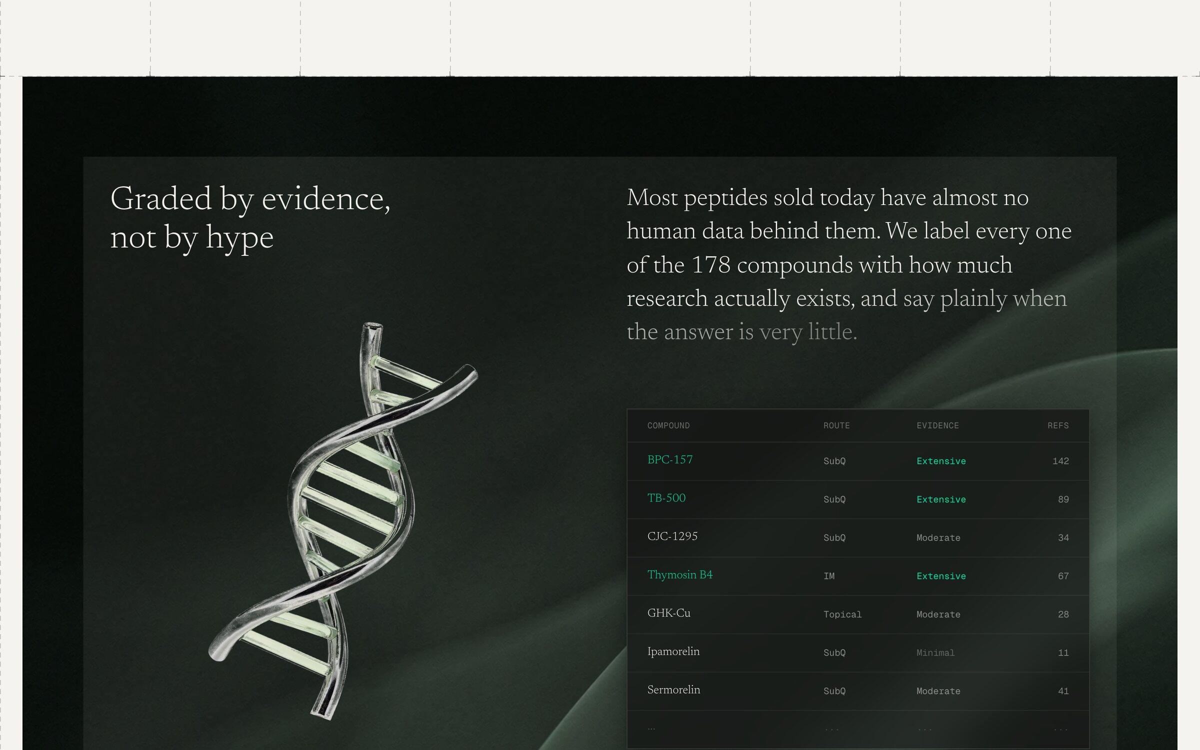
The app grades every compound by how much human research is behind it, and the page is built to show that grade. In the table, compounds with extensive research are green and minimal ones get grey diagonal hatching, with hand drawn arrows in the empty margin saying use and don't use.
I wrote the UI up as their design system
After the first deploy I saw how much they had on the web beyond a landing page, so I had the whole UI written down as a design system they could use after me: the grid and crosshair rules, colour, type, surfaces and motion. peptideai.co now runs on it, with their own copy on top.