dash
An iPhone app for the phone mount on my dash.
One huge number on a black screen: my speed, when I'll arrive, or how long is left.
It was running on my phone about an hour after I sat down to build it.
- For
- Myself
- Role
- Design
- iOS build
- Landing page
- Icon
- When
- Oct 2026
- Stack
- SwiftUI
- MapKit
- three.js
- Netlify
- Not on the App Store yet
- Live
- usedash.app
I built it the night I thought of it
My car shows the speed in the corner of the centre screen, and my phone sits on a magnet mount right in front of the wheel doing nothing. I was stuck in traffic talking the idea through out loud, and that night I built it. The first commit landed 17 minutes after I sat down, and it was running on my phone about an hour later.
It shows when you'll arrive at your current speed
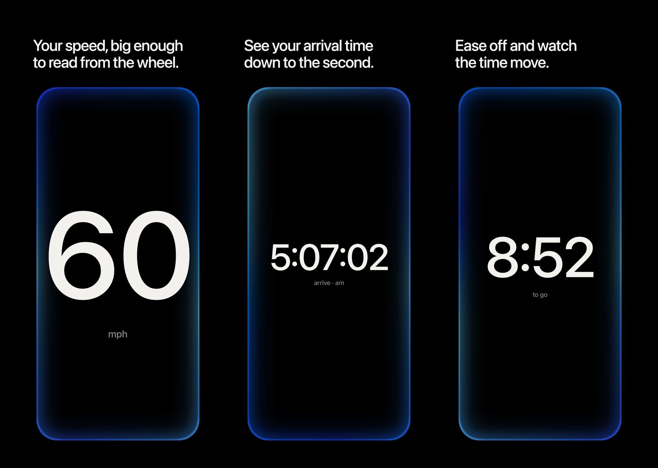
Swipe between three pages: speed, the time you'll arrive, and the time left. Arrival and time left come from the speed you're going right now, not a traffic average, so ease off and the seconds roll up, push it and they roll down. Less and less the faster you go. Speed is abstract. Time isn't. Going 85 instead of 75 barely moves the arrival time.
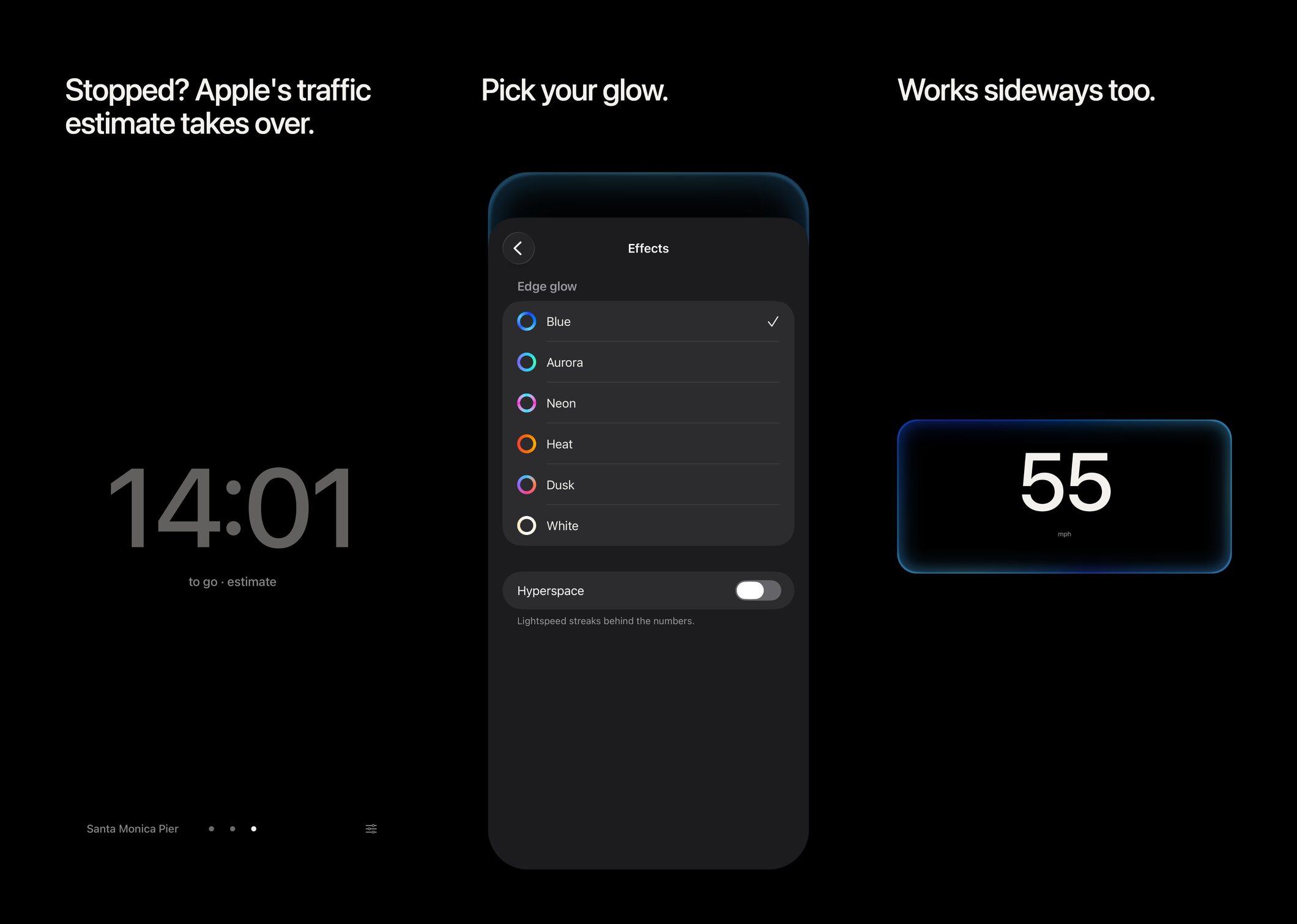
The arrival time shows seconds on purpose, so it's always moving. Stop at a light and it hands over to Apple's traffic estimate, dimmed so you know it's not yours. There's also a match my car setting, since my speedometer reads about 1 mph high. You tap it while driving, type in what your car's speedometer says, and the app keeps that ratio from then on. It only changes the speed page. The math always uses the real speed.
An edge glow gets stronger as you speed up
The first try flashed the whole screen red, then blue past 100. That lasted one look, a car flashing red and blue is the last thing I want. Now a glow runs around the edge of the screen, like Siri, and gets stronger the faster you go. Blue by default, with five other colour sets of my own instead of Apple's. There's a hyperspace mode too, star streaks behind the numbers, off unless you want it.
I made the landing page and the icon
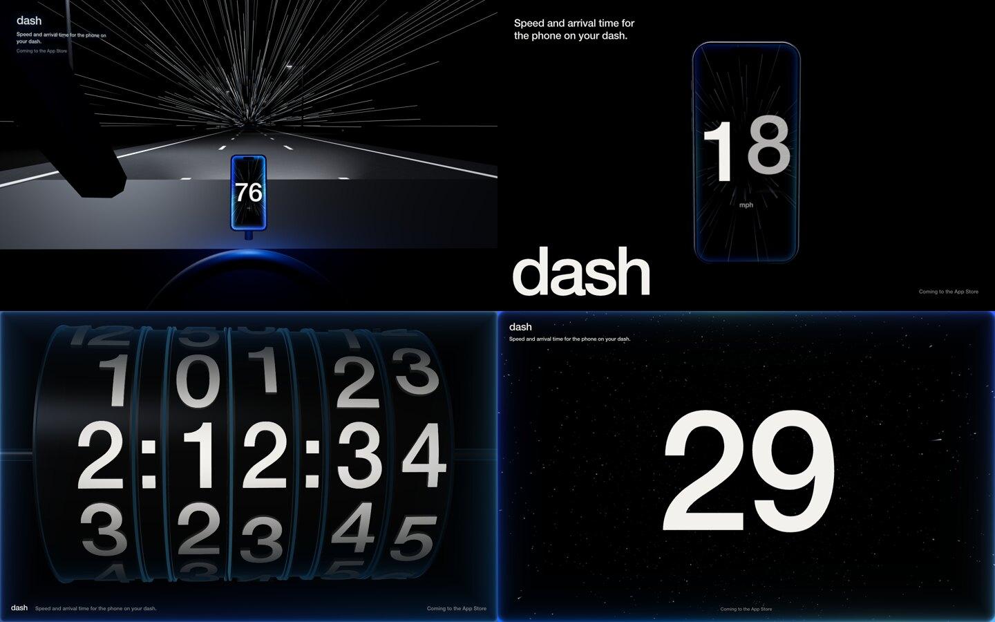
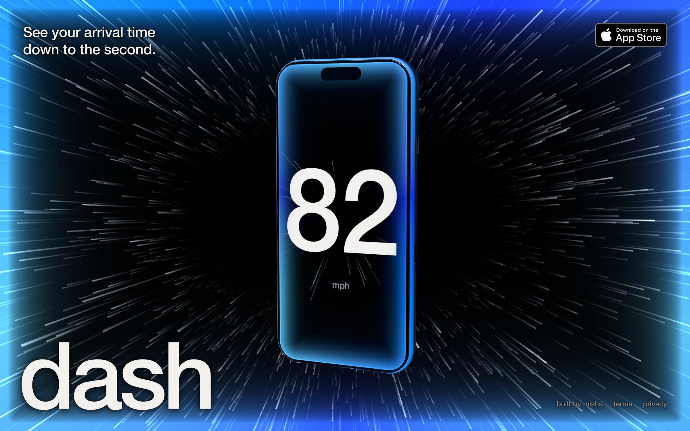
For the landing page I wanted no scroll, just 3D. Four directions got built: a night highway, a 3D iPhone running the app, giant odometer drums rolling the arrival time, and a starfield you hold to hit lightspeed. The phone and the starfield were both good, so they became one page: the phone floating in the warp with the blue glow around the browser. Hold anywhere and it all goes to lightspeed. I wrote the headline myself.
The icon took the most rounds. In the end it's the share card boiled down: the word dash with the warp and the edge glow behind it.