Misha Ovcharenko

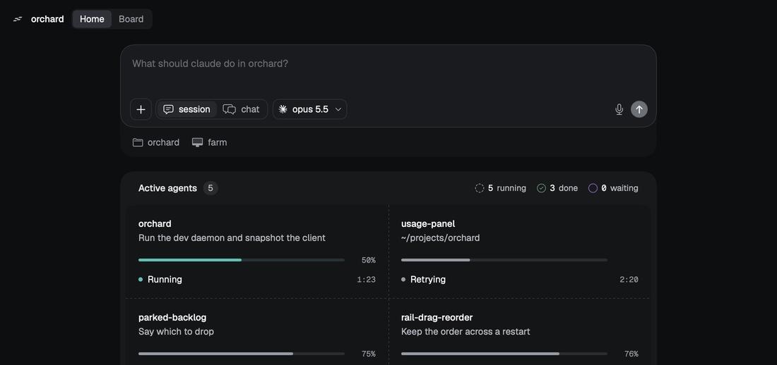
orchard's home: the send box above the active agents
Aug 2026Mac app

orchard

A Mac and iPhone workspace for running build sessions on any of my machines and seeing all of them in one window.

For
Myself
Role
Mac app design and UI
When
Aug 2026
orchard
opus 5.5
orchardfarm
Active agents5
5running3done0waiting
orchard
Run the dev daemon and snapshot the client
50%
Running1:23
usage-panel
~/projects/orchard
Retrying2:20
parked-backlog
Say which to drop
75%
Compacting0:13
rail-drag-reorder
Keep the order across a restart
76%
Compacting2:20
keyboard-layouts
~/projects/orchard
3 in background

One window

My work ran across a terminal, a browser full of tabs, a few dashboards and the repo, and switching between them took longer than the work. I designed orchard's Mac app so every session lives in one window: projects in a sidebar, tabs across the top that behave like Chrome's, and a rail that collapses instead of closing.

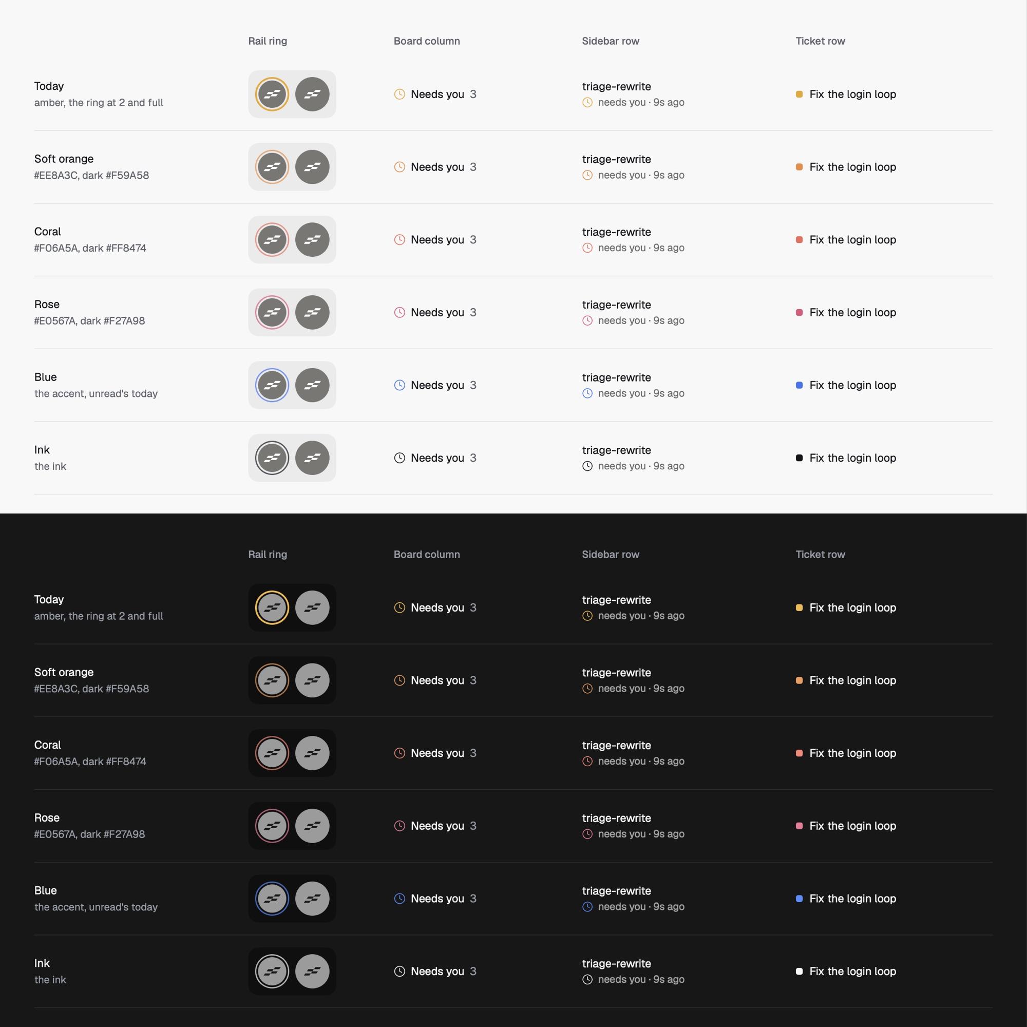
One colour for needs-you

Colour had picked up five meanings across the app. I cut it to one: a session waiting on you. A tile that needs you wears a coral ring in its own shape instead of a count, and a waiting question docks over the send box so the transcript keeps scrolling under it.

Command-Return everywhere

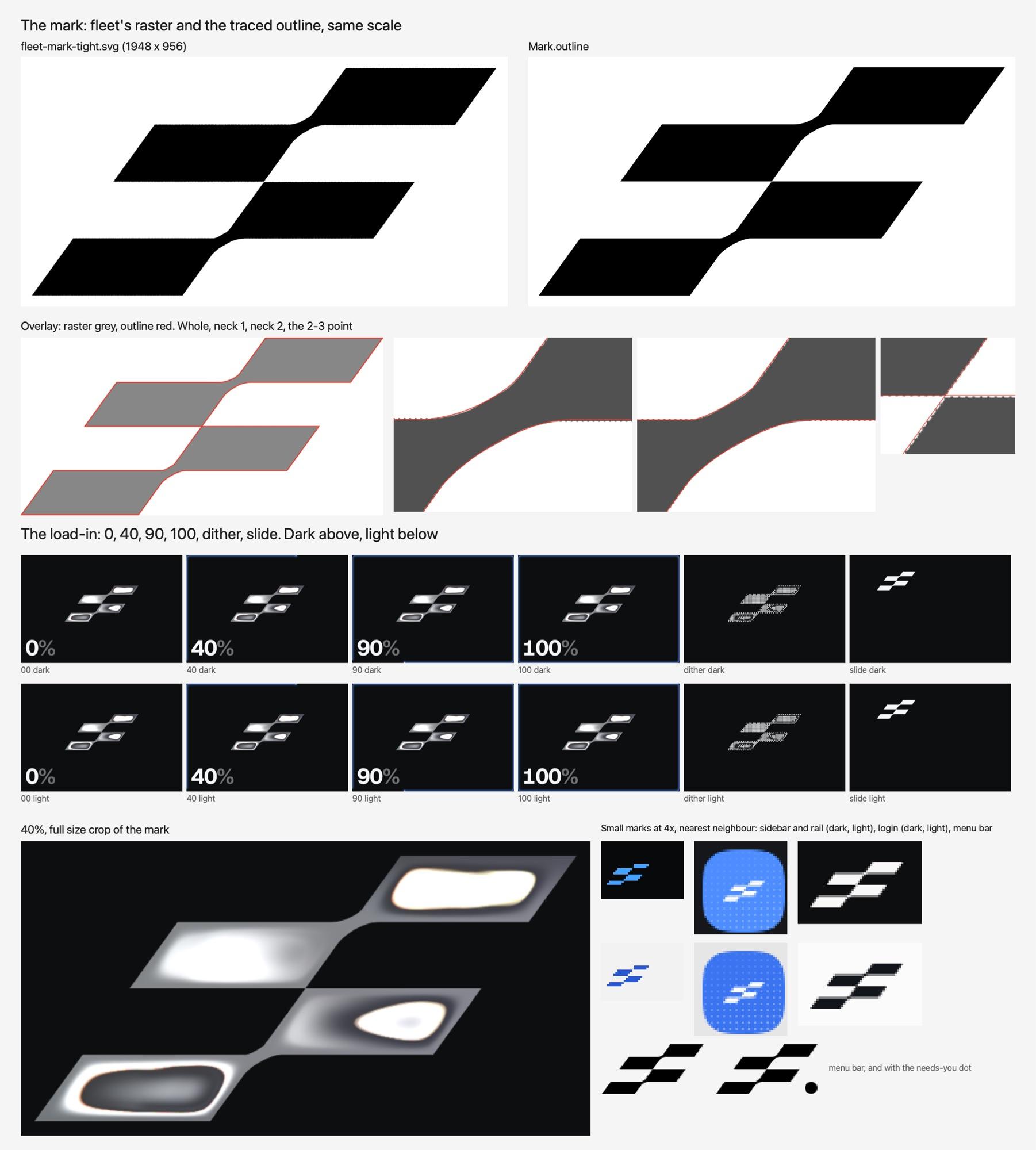
Command-Return confirms every dialog, permission and question, and Return alone only sends. Text on the ticket board clears 4.5:1 contrast in light and dark. On launch the mark arrives as dithered squares and settles into the sidebar. It runs on my Mac Studio, and it's where I work from.
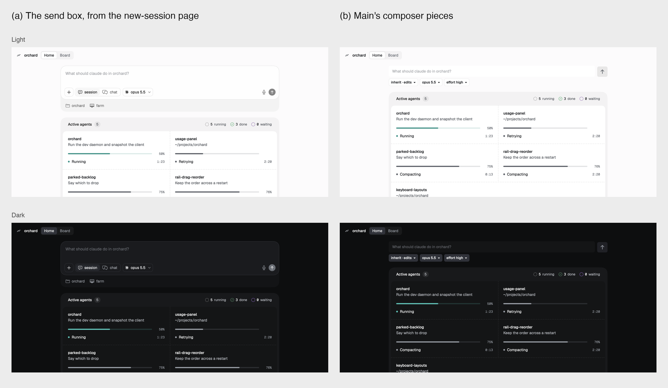
Orchard's Home: the send box above the Active agents grid, light and dark
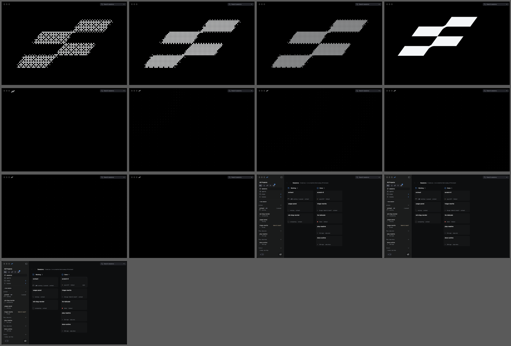
Orchard's splash mark dithering in and handing off to the sessions board
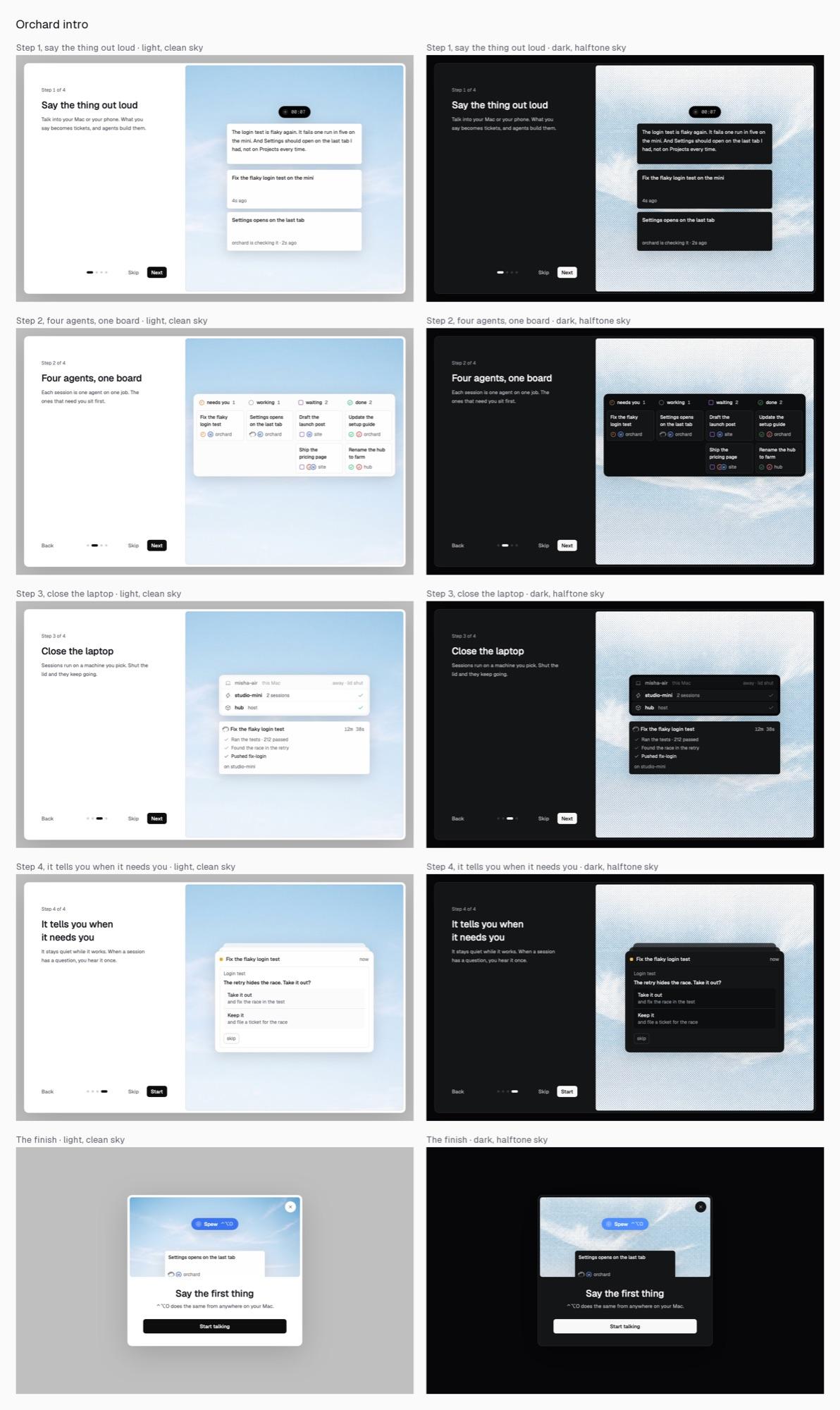
Orchard intro review sheet: four onboarding steps and the finish card, light with clean sky beside dark with halftone sky
The mark traced from fleet's raster, the dithered load-in at 0, 40, 90 and 100 percent, and the small marks for sidebar, login and menu bar
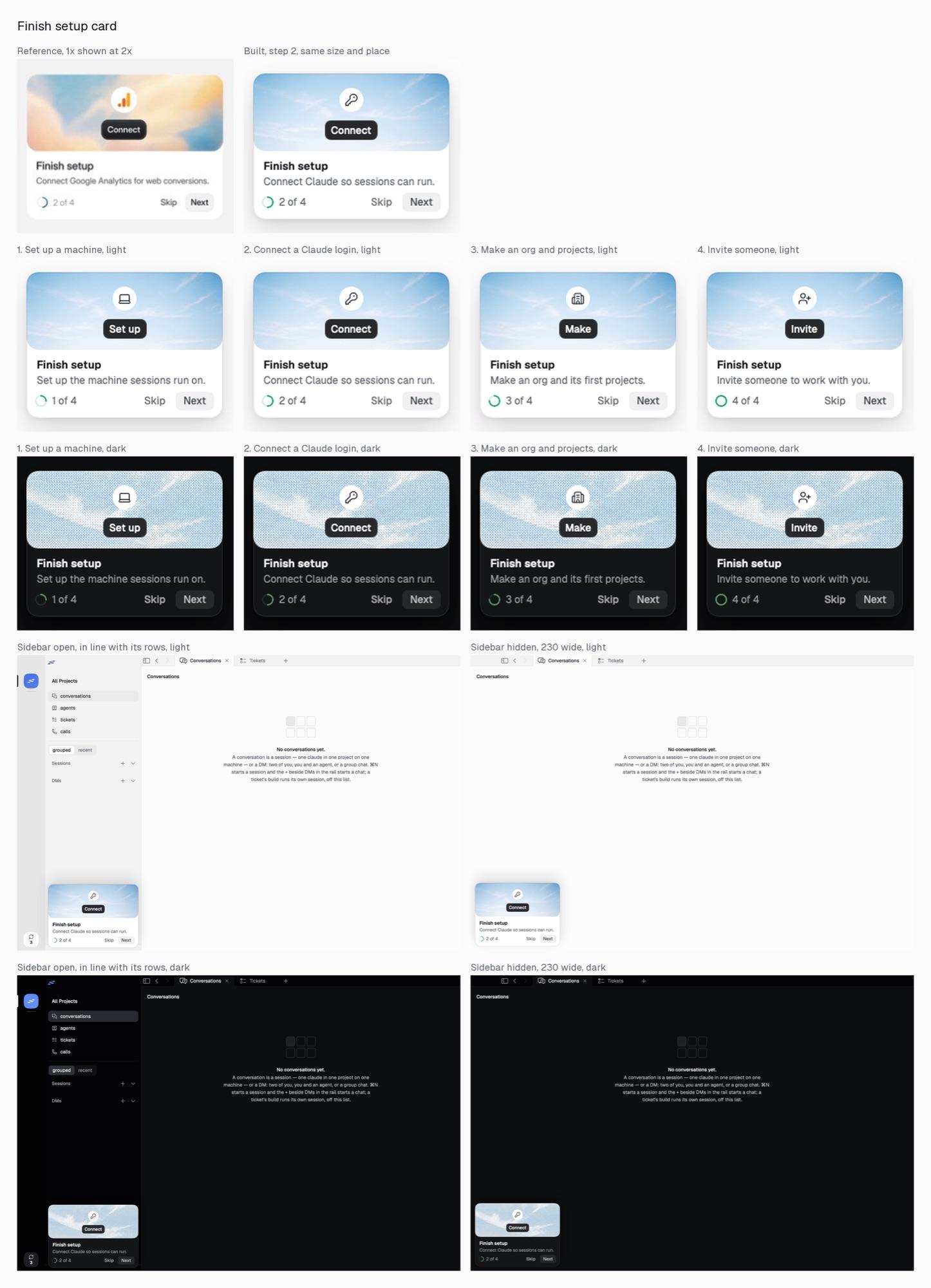
Finish setup card: a reference beside the built card, all four steps in light and dark, and the card sitting in the empty app
Six colours tried for the needs you state across the rail ring, board column, sidebar row and ticket row, light and dark
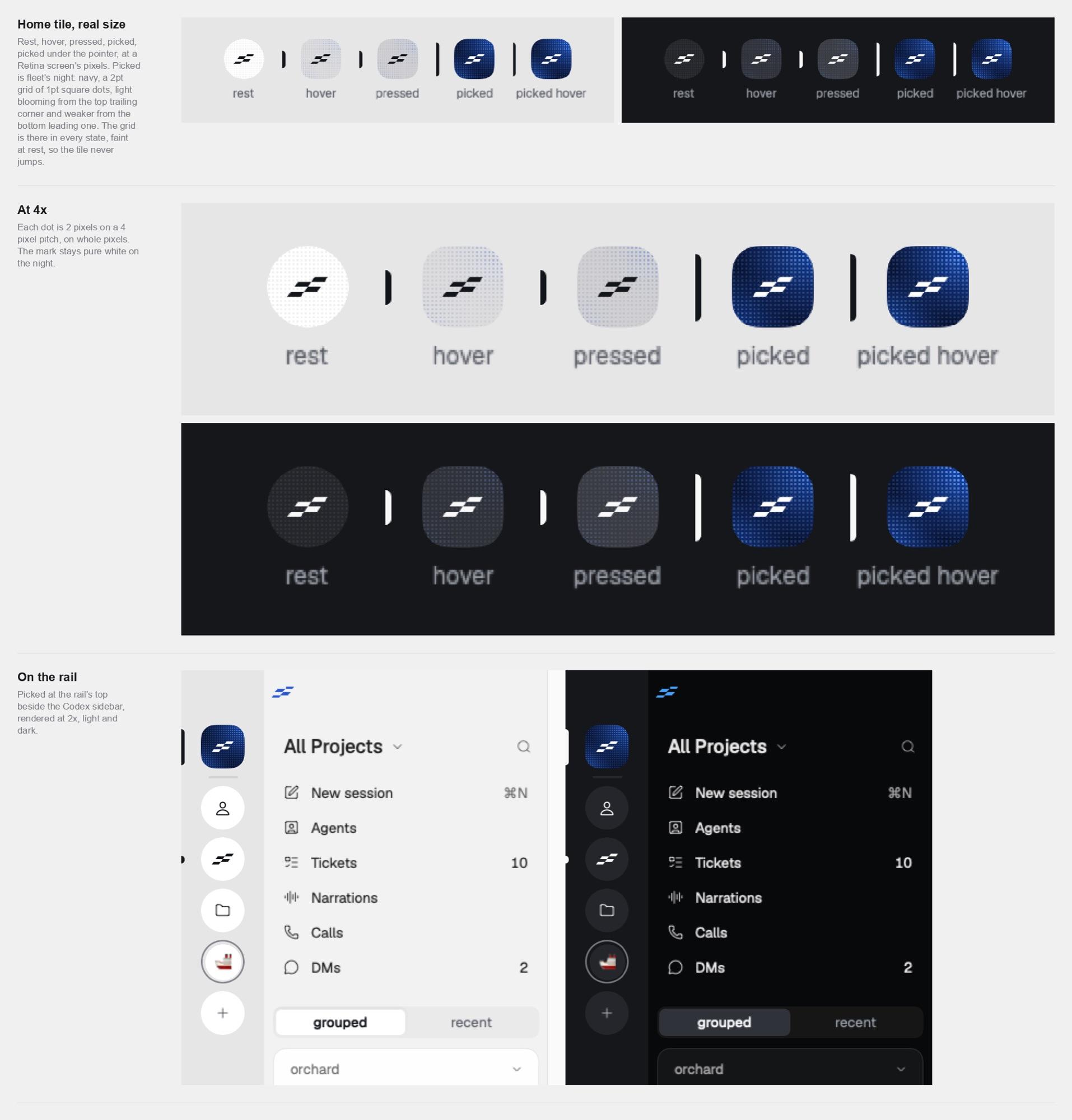
The rail's home tile at rest, hover, pressed and picked, at real size and 4x, then in place beside the sidebar