Misha Ovcharenko
Better Translate
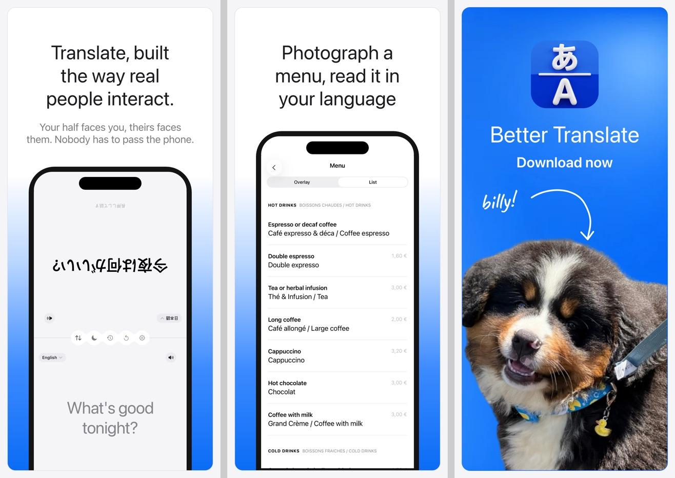
An iPhone translator for two people at one table, with the screen split so each half faces its reader.
- For
- Ultim8 Holdings
- Role
- Design, paywall and onboarding, App Store listing, landing page
- When
- Aug 2026
A phone between two people
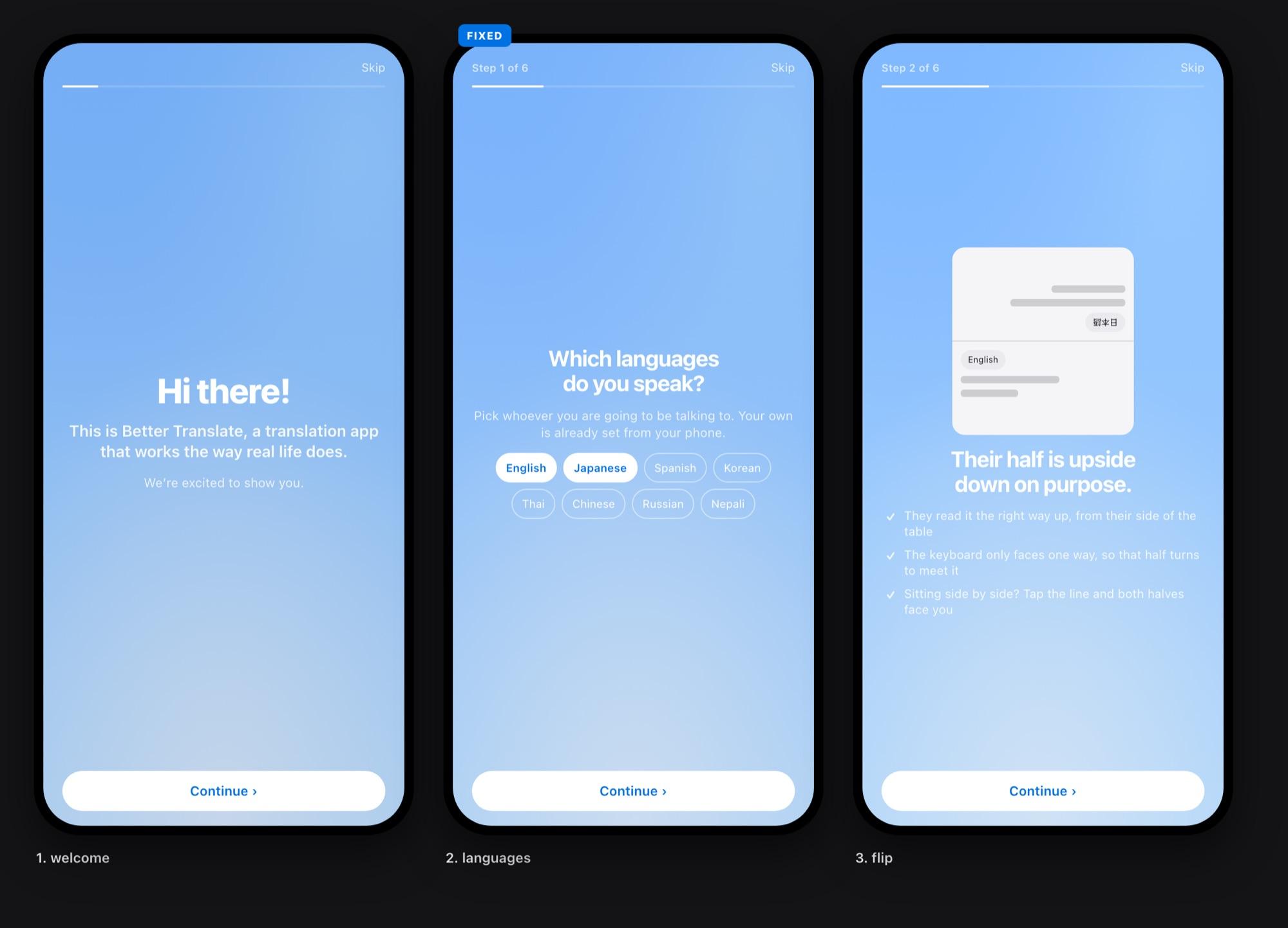
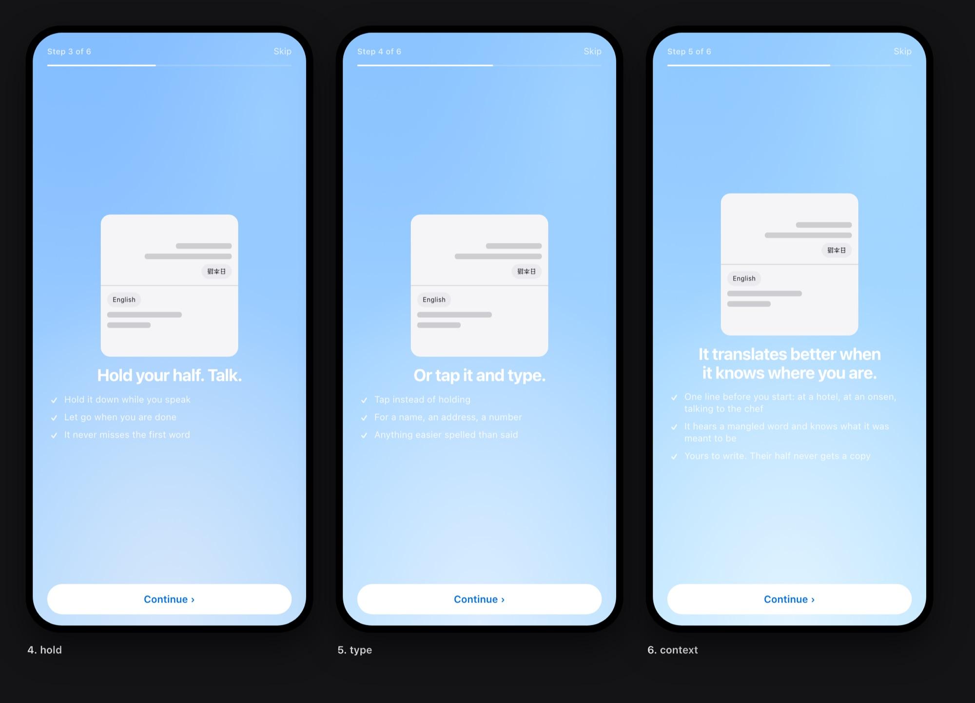
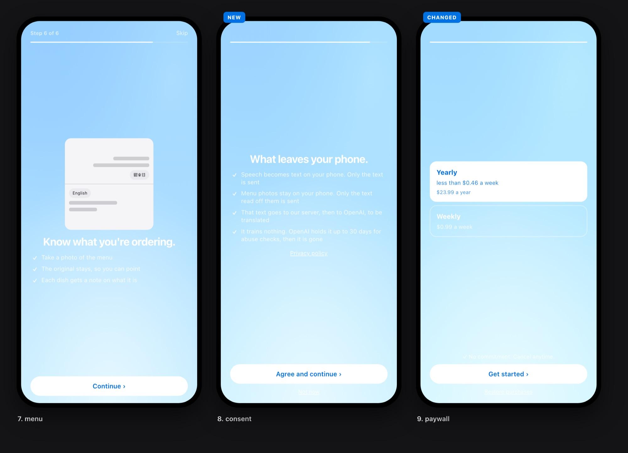
The app already worked when I came on: one phone flat on the table, the far half rotated so the other person reads it the right way up. My job was to make it feel like a funded product, so I took the design, the paywall and onboarding, the App Store listing and the landing page.
Blue half, red half
The half you hold glows blue and the half across glows red, one colour each, and whichever half is listening lights its own edge. The selected tool used to be a solid blue capsule under frosted glass. I made it a glass lens that slides between tools.
The landing page
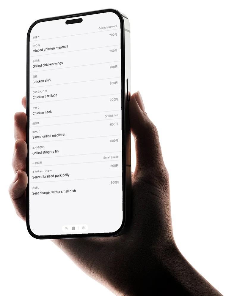
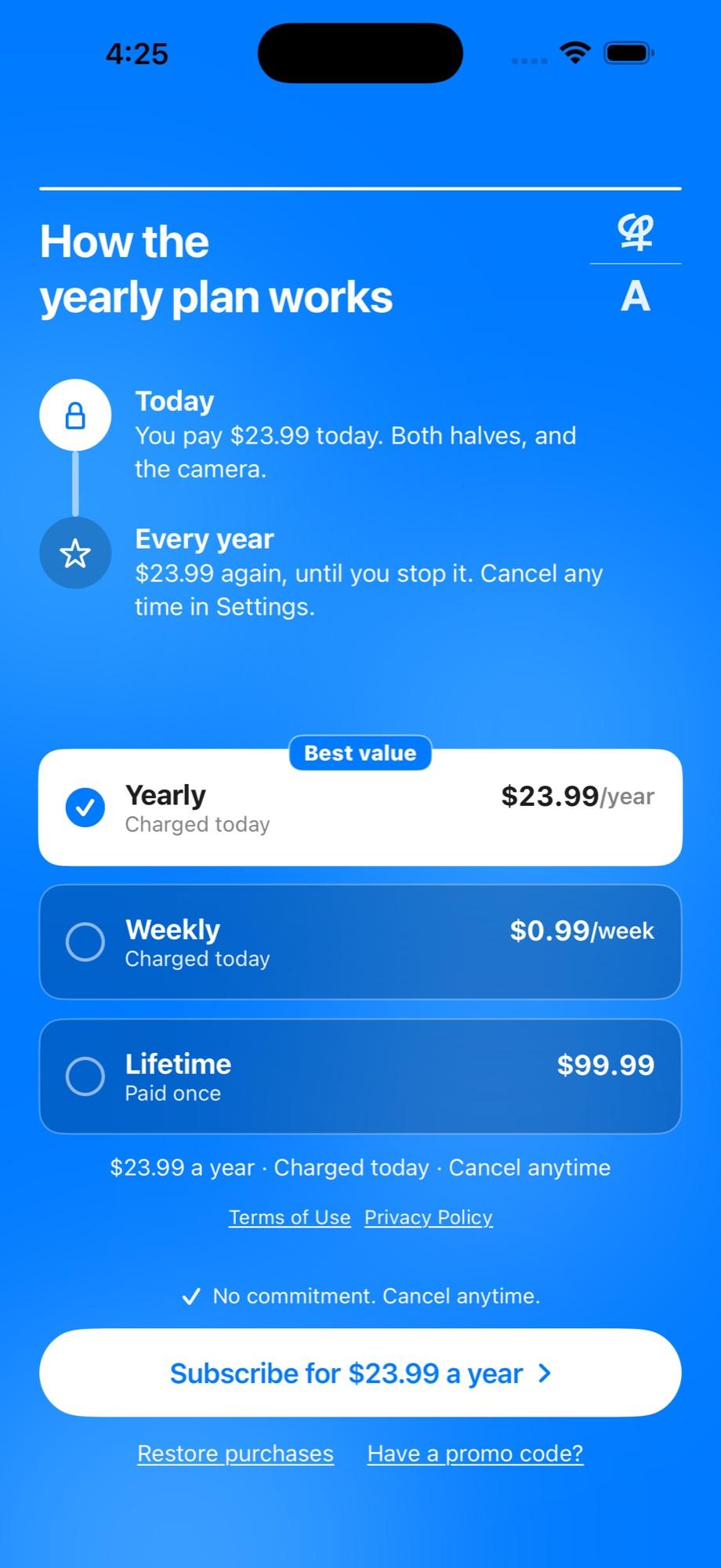
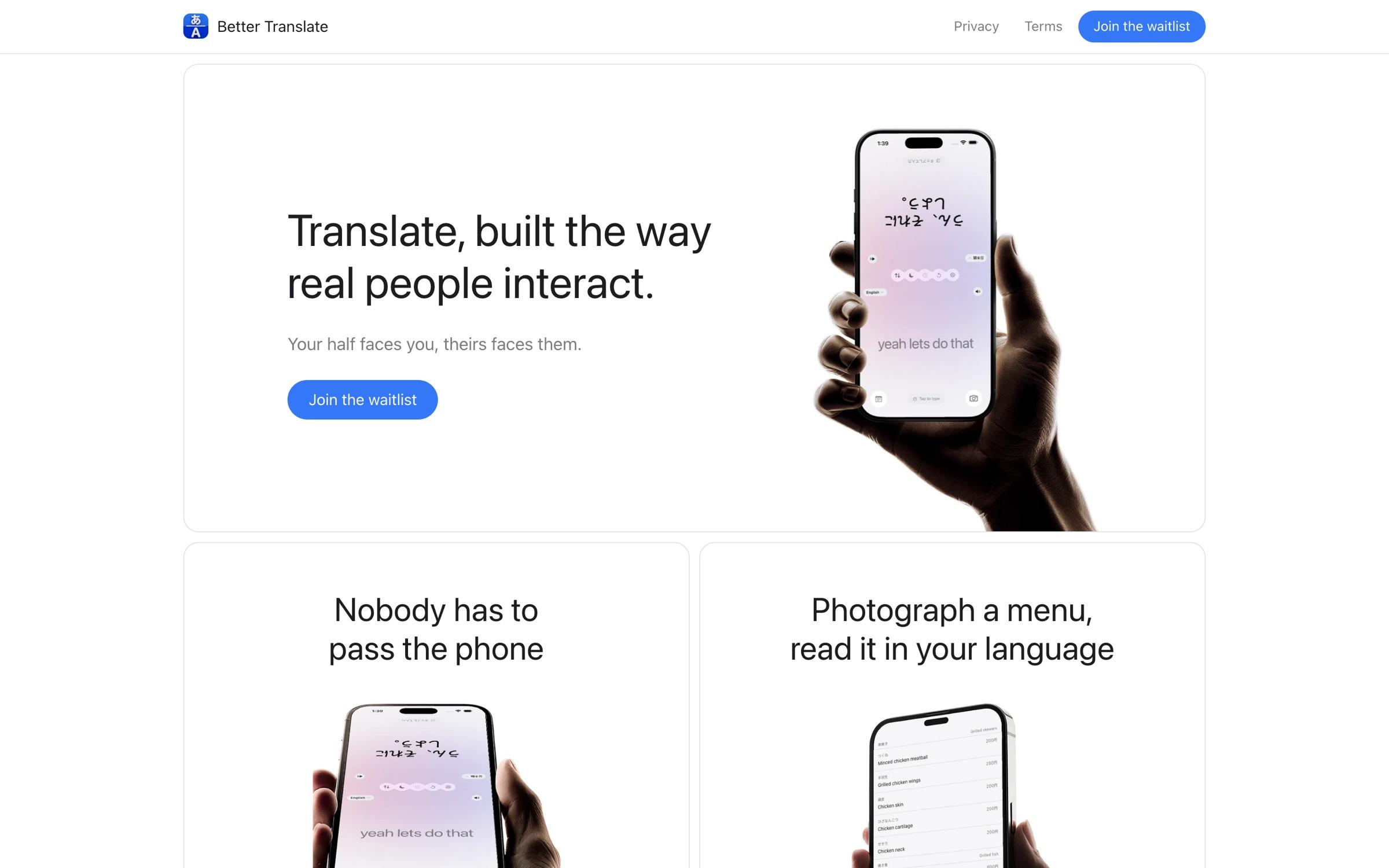
The site is a dark blue ground with borderless white cards, separated only by 4px gaps, one headline per card and real screen captures. The App Store frames are its first three cards, so the store and the site read as one. The paywall leads with the amount charged.